From Laurin & Klement to Škoda
In 1895, L&K started making its Slavia bicycles and, later on, motorbikes in Mladá Boleslav. Automobile production was launched in 1905. The Laurin & Klement logo graced cars from Mladá Boleslav until 1925, since when they have sported Škoda’s winged-arrow symbol.
1895
Slavia Logo (1895-1905)
Bicycles and motorcycles were made at the Mladá Boleslav workshop under the Slavia brand. The logo was based on a wheel with lime leaves to symbolise the Slavic nations. The names of the company’s founders (Laurin & Klement) were added and went on to become the main motif of a new logo.
1905
L&K Logo (1905-1925)
The design of the L&K logo was influenced by the early-20th-century Art Nouveau artistic style. Perhaps playing on the similarity between the name Václav Laurin and laurel leaves, the initials of the company’s two founders are surrounded with a laurel wreath, associated with victory.
1926
Škoda Logo (1926-1933)
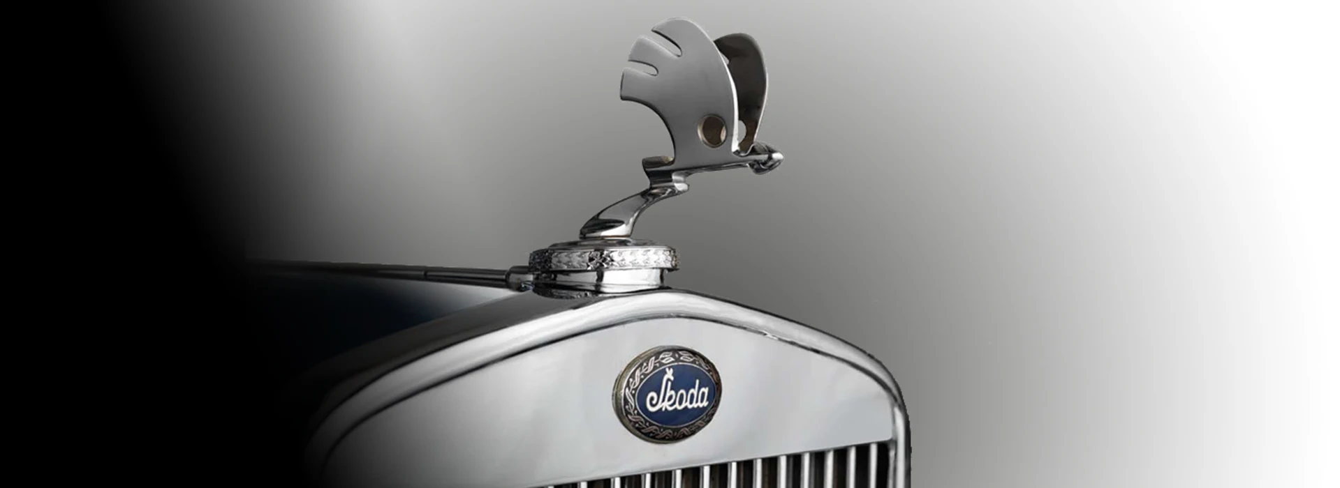
Starting in 1926, cars were produced in Mladá Boleslav under the Škoda brand. Despite the completely different brand name, the new design shows continuity with its forerunner. Although the Škoda logo has a new, oval shape, the brand name – surrounded by laurels – remains the centrepiece.
1926
Škoda Logo (1926-1990)
The logo with the famous “winged arrow” was first used in 1926. Its origin is shrouded in mystery, though the idea (the stylised head of an Indian wearing a five-feathered headdress) has occasionally been attributed to Škoda Plzeň’s commercial director, Tomáš Maglič.
1999
ŠKODA AUTO Logo (1999 - 2011)
The black-and-green logo, used from 1999, gave the Škoda brand greater originality, with black symbolising the hundred-year tradition and green signalling environmental production.
2011
ŠKODA Logo (2011 - 2016)
Under the strapline “The New Power of Škoda”, in 2011 Škoda presented the core elements of its new corporate design – distinguished by freshness and precision. The traditional winged-arrow logo features a new spectrum of colours to look even more distinct and precise than ever before.
2016
ŠKODA Logo (2016-2022)
The new ŠKODA logo, launched in late 2016, reflects the motto “Driven by Inventiveness. Clever Ideas – Since 1895.” It underscores ŠKODA's heritage and ties to the VW Group. The redesign features a wordmark beneath the winged arrow in a chrome ring, aligning with the updated Corporate Identity.
2023
ŠKODA Logo (Since 2023)
Škoda’s new identity separates the wordmark and winged arrow, making the name the primary symbol. The updated typeface is clean, symmetrical, and Czech at heart – featuring a stylized háček in the “Š”. Research shows the new wordmark improves recognition and recall.
